As designers, it’s our job to lead the way through the hundreds of steps that we know need to happen for your office design project. (Okay, that’s an understatement – there are thousands of steps!). No need to be overwhelmed though — we’re here to help every step of the way. We’ve distilled our top “big picture” considerations to help you start planning as you rethink your workspace. Whether your project is big or small, considering these elements will help the project come together to create the dream environment you have in mind.
Plan Everything
This may seem like the most obvious step, but we have so often seen offices that end up in chaos after an immediate need was filled without considering the overall impact. Like when you need a new workstation and you park it in the only spot available, even if that means it ends up in that unused corner beside the bathroom. Suddenly people are upset, frustrated, and less engaged as they deal with foot traffic, noise, and interruptions. And so begins: the Tetris game of furniture placement, resulting in a maze of sorts. That lost and confused feeling will extend into everything your team does.
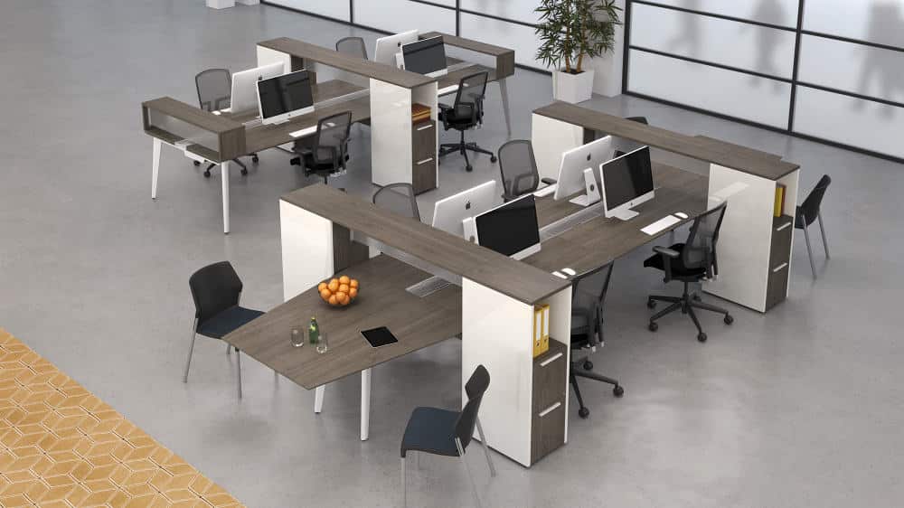
No matter what you do, how you work, or who you are, you need to have a well-organized environment to be your most productive and efficient. This is even more important when you are sharing the office with others. Think about the best way to leverage your space to improve workflow and people flow. It is worth the time and effort to discover that you can do more with the space you have when it is optimized, allowing you to fit that extra bookshelf or workstation without it feeling crowded or cluttered.
Have a Budget
This makes sense, right? Yes! Have a budget. Then double it. And then add some more. We’re not trying to scare you, only to prepare you. You may think it’s as simple as some drywall and paint, but there are always unknowns in any renovation or construction project. You need to allow for these contingencies because they tend to happen in critical systems like electrical, plumbing, and HVAC. It might be easier to adjust your budget for furniture, finishes, and fixtures. Infrastructure is less flexible in that it ensures proper airflow and temperature control, water for kitchens and bathrooms, power outlets placed where you need them, and sufficient light for your workers to do their jobs.
Part of our job is helping you to get what you want and need with the least amount of disruption in services and construction, and of course, staying within your budget. Our experience shows that if you remember to consider these underpinnings as you plan for your costs, it will benefit you in the long run.
Scale and Proportion
Scale and proportion are critical to making a space both look and feel amazing while facilitating the work being done there. We know it’s hard to let go of the office furniture from your previous location because it’s still in good shape and functional. But if the style is dated and it’s a large-scale system, your spacious new space may suddenly feel very small when overwhelmed by furniture that just doesn’t work for this time and place in your business. You might even find yourself bumping into desk corners and having inefficient pathways for people as they move around.
Think about what you need really need within that space (i.e. desk, chair, guest seating, a standing table for quick meetings, filing and storage) and then think about the size of the room. This empowers you to choose pieces that are required to make the space work, but which are proportional to and appropriate for each area.
Aesthetically, it can also be fun to play with scale. You might add an abnormally large lamp or artwork that creates a point of interest or to make the space feel more eclectic. Just keep in mind that this has to be done purposely and thoughtfully, not because you happen to have a gigantic chair and want to keep it. (Don’t worry – we’ll help you understand the difference).
Have Courage with Colour
If you have seen any of our designs, you know we love colour! Not only are we are not afraid of colour, we spend a great deal of our time getting our clients to trust that they like colour too. The key is to use it correctly and in the right shades. Brighter doesn’t always mean more energy and creativity; it could also mean headaches and aggravation. Adding colour to every wall or area isn’t always the right answer either.
Little bits of complementary colours throughout the office can make it feel balanced and energized. Sometimes this means on the walls or some shots of colours in the furniture, perhaps a light fixture that suddenly adds some unexpected interest or acoustic panels that integrate into the design artistically while helping to manage sound. And don’t forget the flooring. By changing the colour (and types) of flooring you can delineate an entire area without building any walls. Colour is one of the most important things to get perfectly right in a space and well worth getting some help with colour consultation. We take a lot of inspiration for the colours we use in the spaces we design from the brand of the business. This brings us to…
Stay on Brand with a Theme
When designing a space, one of the first things we come up with is a theme. This goes hand and hand with your brand. When we say brand, we don’t just mean the logo and the colours. We mean the perception of the company by others, in every way both inside and outside of the office. Considering the theme and brand in every single decision along the way will help your design contribute to the lasting impact of how you are seen and remembered.
If the company’s brand is more direct and assertive, perhaps we will consider triangles and sharp edges within with the space as a theme. If the company is more relaxed and nurturing, we might look at more soft seating and rounded features. Selecting pieces that are outside of your theme can take the design off track, and soon the entire look and effect can become disconnected. On the flip side, small, unexpected details can pull it all together. We’ve even had coloured toilet tissue in spaces where the brand was fun and leant itself to cheeky accessories.
There’s no question that there is a lot to think about when designing or redesigning your office space, but if you approach it as an opportunity to improve your business in many ways, from brand to productivity, it becomes a very satisfying endeavour. And as your trusted designers, we will be with you every step of the way to take your big picture concept through all the many details to real-world results.
Need some help as you start to plan and implement your ideas? We can’t wait to hear about your business, your ideas, and your needs. Let’s set up a time to talk – email us at design@studioforma.ca.

